The Project Overview
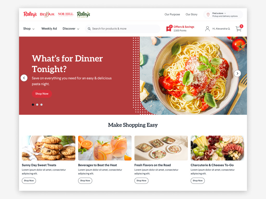
As the designated design system architect for Raley's digital expansion, I was tasked with creating a comprehensive design framework for their mobile e-commerce experience. This foundational system would initially serve Raley's flagship mobile app before extending to two newly brands in their portfolio.
Timeline: 3 months
Scope: Mobile e-commerce design system
Impact: Supporting multiple retail brands within Raley's ecosystem
Role: Primary design system architect, collaborating with design leadership
Context
The project emerged at a pivotal moment for Raley's. With their primary e-commerce website recently launched and undergoing optimization, the organization needed a scalable design framework to support their expanding digital presence. This design system would serve as the blueprint for creating consistent, high-quality user experiences across their growing family of retail brands.
While working under the guidance of our lead designer, I took primary responsibility for architecting and developing the design system. This involved regular feedback sessions to ensure the system aligned with both immediate needs and long-term business objectives.
Core Responsibilities
Led comprehensive gap analysis of Raley's app to identify standardization opportunities and establish development priorities
Created and maintained a Figma component library with consistent UI patterns, flexible architecture, and clear documentation for future brand integration
Developed comprehensive design guidelines covering component usage, design patterns, implementation specs, and brand requirements
Facilitated system adoption through workshops, training sessions, and ongoing support, establishing feedback channels for continuous improvement
Icon System Overhaul
A key finding from the gap analysis revealed significant redundancy in the app's icon system. Through careful auditing and consolidation, I was able to reduce the icon library from over 100 unique icons to a streamlined set of a few dozen, organized by size categories. This eliminated duplicates and established a clear naming convention.
Button Architecture
The button system needed a complete overhaul to address inconsistencies in the app. I developed a comprehensive foundation with multiple states (default, disabled, focus, tap), sizes (32-56px), and styles (filled, outline, transparent). This standardized system then served as the building block for larger components like product cards, quantity selectors, and modals, ensuring consistency across the app while reducing development time.
Building Scalable Navigation Systems
I developed a modular menu system by combining smaller components into flexible templates. These menu patterns served as versatile building blocks throughout the app - from category navigation to filtering systems. Each menu template was designed to be easily adapted and modified, allowing designers to quickly create new sections while maintaining consistency. For example, a base menu component could be configured for product categories, account settings, or order history simply by adjusting its content and layout parameters.
Creating a Unified Card System
The design system's card components presented unique challenges due to their complexity and varied use cases across the app. I developed a comprehensive card architecture that included product listings, promotional offers, and shopping cart items - each requiring distinct information hierarchies and interaction patterns. Through multiple rounds of user testing, we refined these components to optimize for both usability and visual consistency. For instance, product cards needed to effectively display pricing, quantity selectors, and promotional badges, while coupon cards required clear expiration dates and redemption states. Cart cards presented another layer of complexity, needing to balance detailed product information with quick editing capabilities.


