Intro
The case study required that we redesign a meditation app called Unplug that is available both on the Apple App Store and Android’s Google Play Store.
In this case study, you will find our breakdown and the approach we took towards the complete redesign of the app.
UI Problems
Unplug is a meditation product in a competitive industry. Their current product is not accessible, lacks hierarchy of information, has inconsistent spacing, and the general experience of finding and selecting a session is not clear.
Case Study Goal
For this case study, we focused on improving Unplug's overall interface with an enhanced color palette, text range, and spacing system. In addition to these foundations, we created an interactive prototype in Protopie that allows users to explore, select, and complete a meditation session.
Inspiration
Our redesign of Unplug was inspired by both meditation apps (Headway, Calm, Deep Meditate) and audio streaming platforms (Zero, Spotify, Tidal, YouTube Music), combining effective mindfulness techniques with innovative content delivery to create a unique and engaging meditation experience.
Moodboard
Our moodboard merges bold and calming visual themes, utilizing a vibrant color palette with strategic gradients, clean layouts, and engaging imagery to create a visually striking yet soothing user experience that promotes mindfulness.
Sketches
Before creating and designing any of the components, we took a bit of time sketching out some of our ideas. This allowed us to brainstorm ideas without putting any constraints.
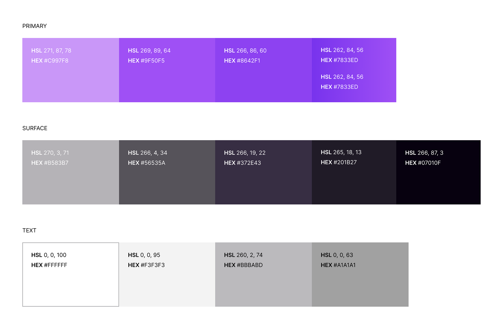
Primary and Feedback Colors
We designed an accessible color palette for our meditation app, featuring bold and dark primary tones that encourage users to take "bold steps" in their mindfulness journey while maintaining a sense of calm and clarity, ensuring accessibility compliance through the use of the Contrast plug-in.
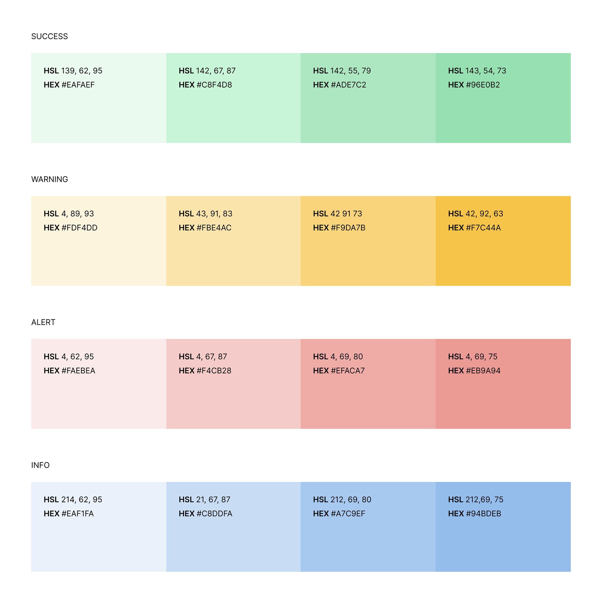
We then focused on creating a set of feedback colors. After further exploration of the original design, we realized that it did not have a set of cohesive feedback colors. All of the feedback colors were depicted in the same hue, making it difficult for users to distinguish between alerts, success, warning, and information.
Type Scale
When it came to type scale our goal was to make sure that each type has a purpose and to limit our scale as much as possible in order to create a guide that is simple yet effective.
Grid System
For the mobile Grid System, we went with 4 columns, 32px margin and 16px gutter, We decided to go with the larger margins to give the design a little bit more breathing room. For the spacing, we decided to stick with the 4px rule, in order to make sure that designs would be responsive for larger devices.
Components
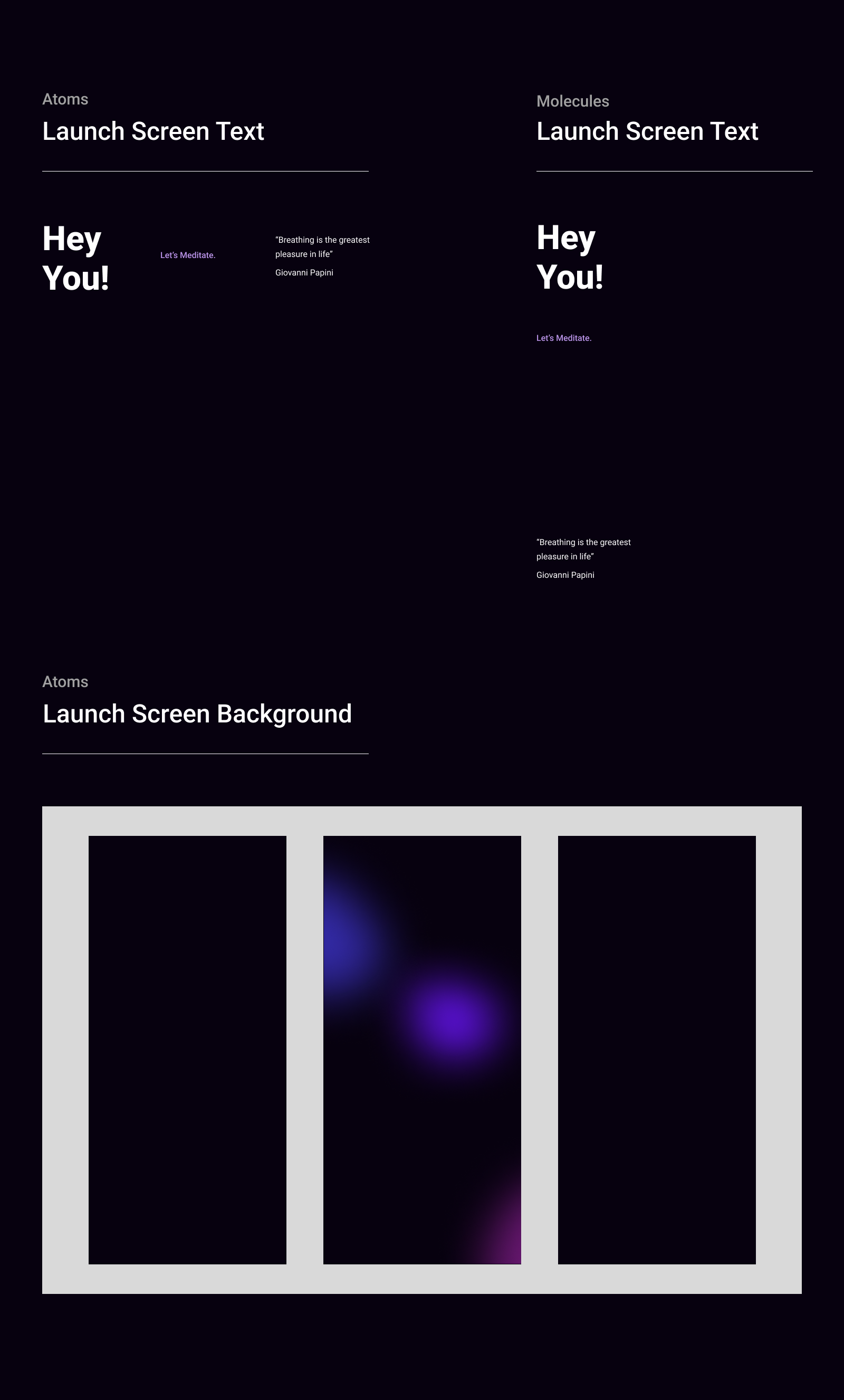
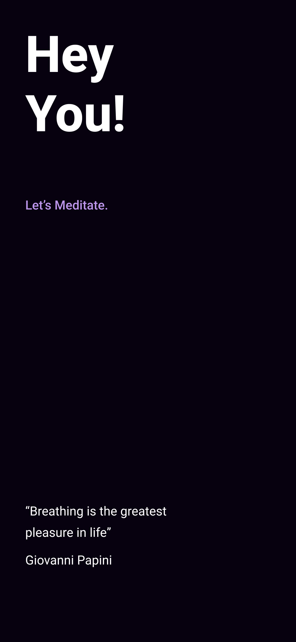
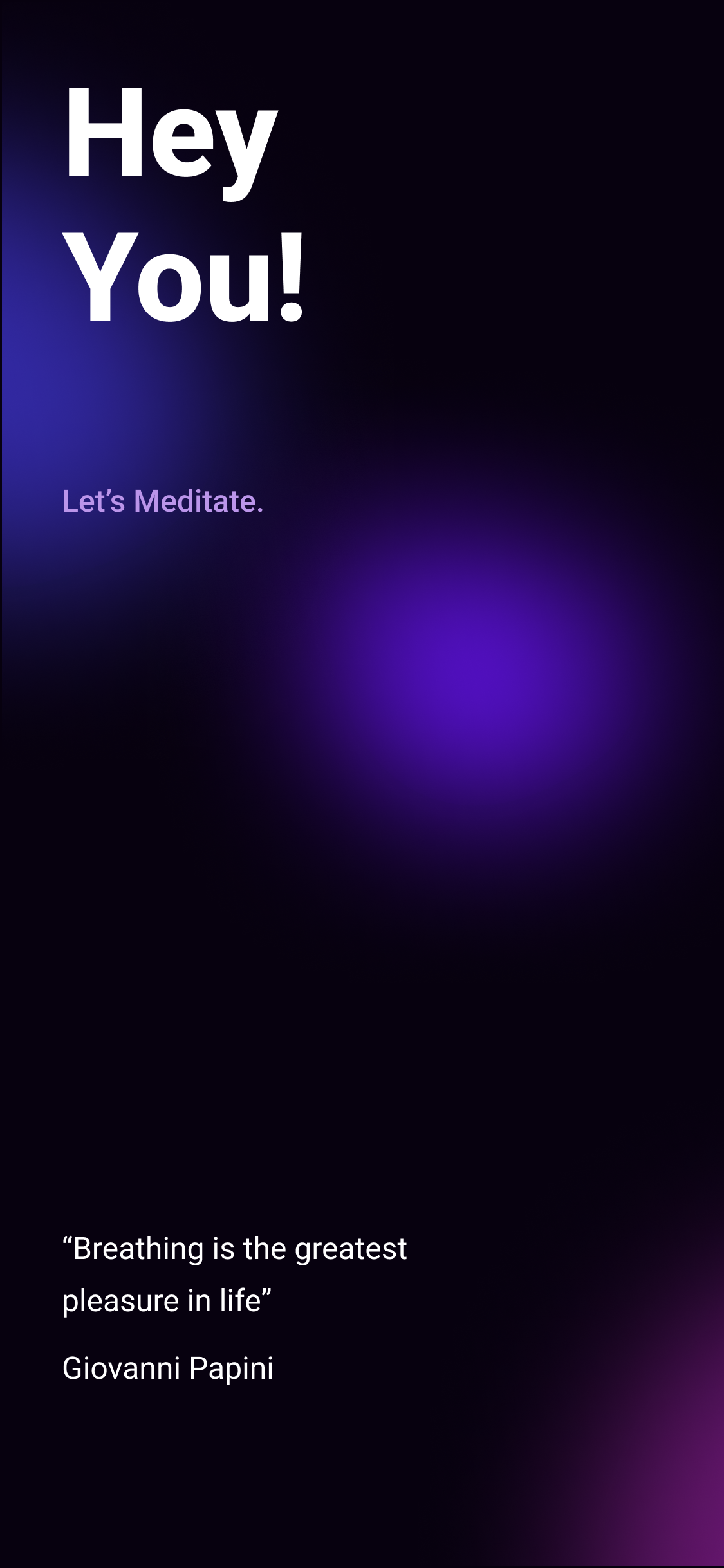
We designed a dynamic launch screen with a glowing background that lasts for one breath, immediately conveying the app's purpose and shifting users' mindset before transitioning to the home tab.
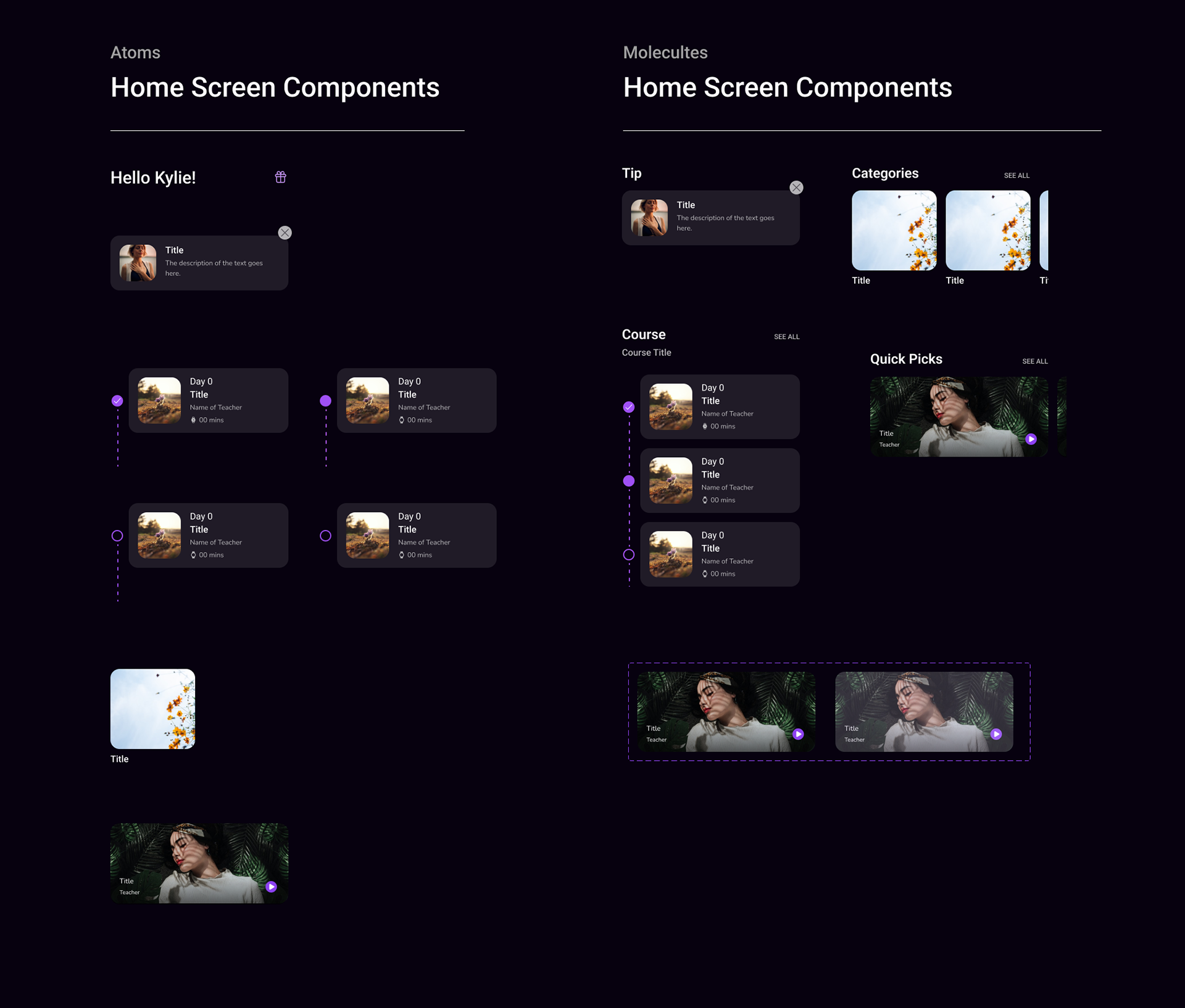
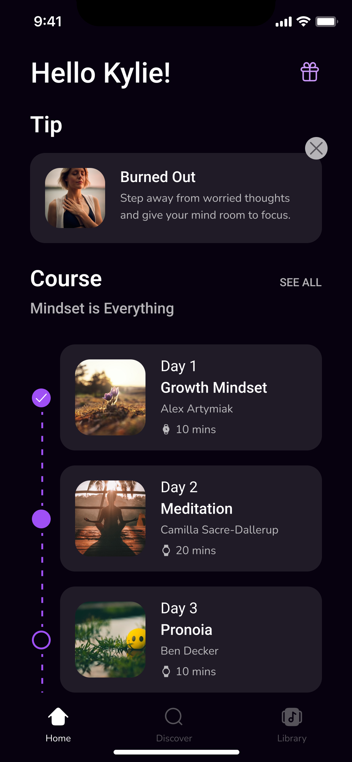
For the home screen components, we divided the home tab into four sections: tips, courses, categories, and quick picks. We wanted users to have quick access to their meditations directly from the home tab. This is in contrast to the original design, which required users to click multiple times before actually accessing their content.
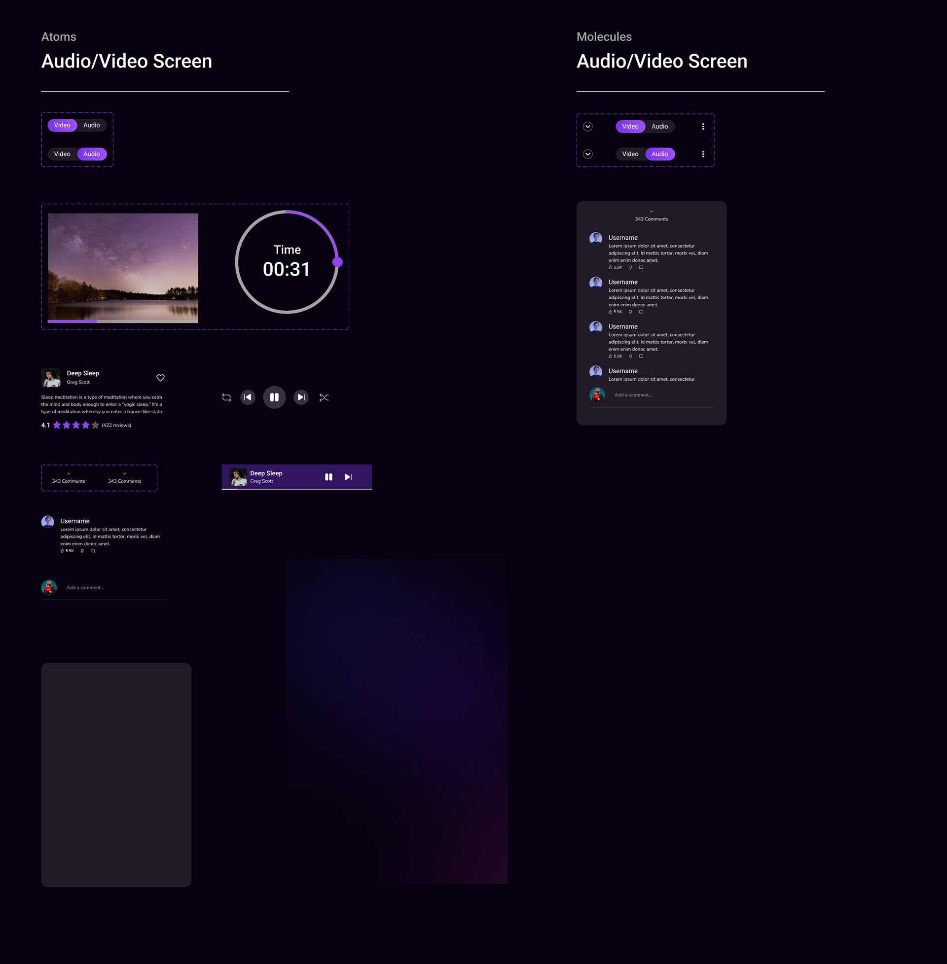
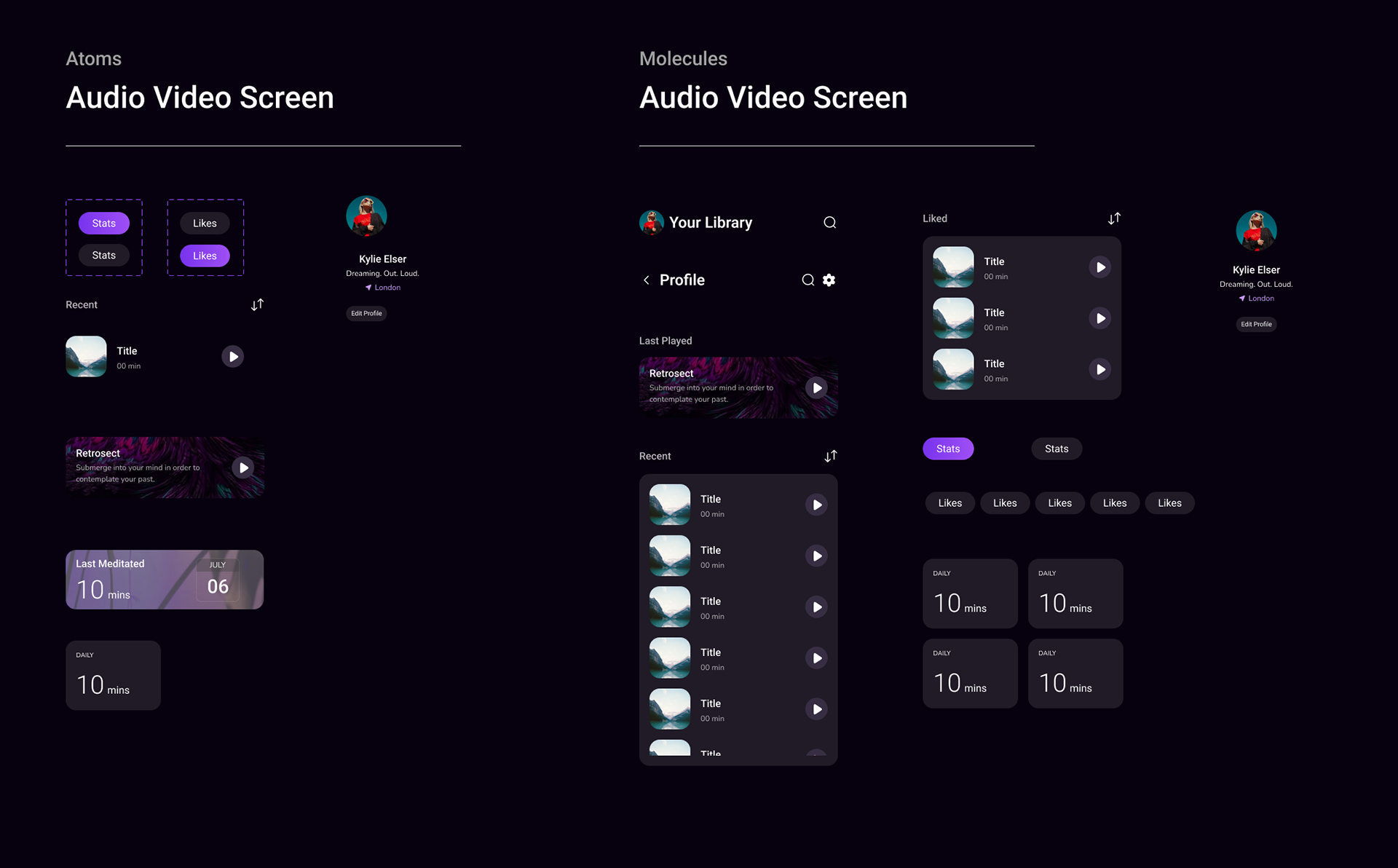
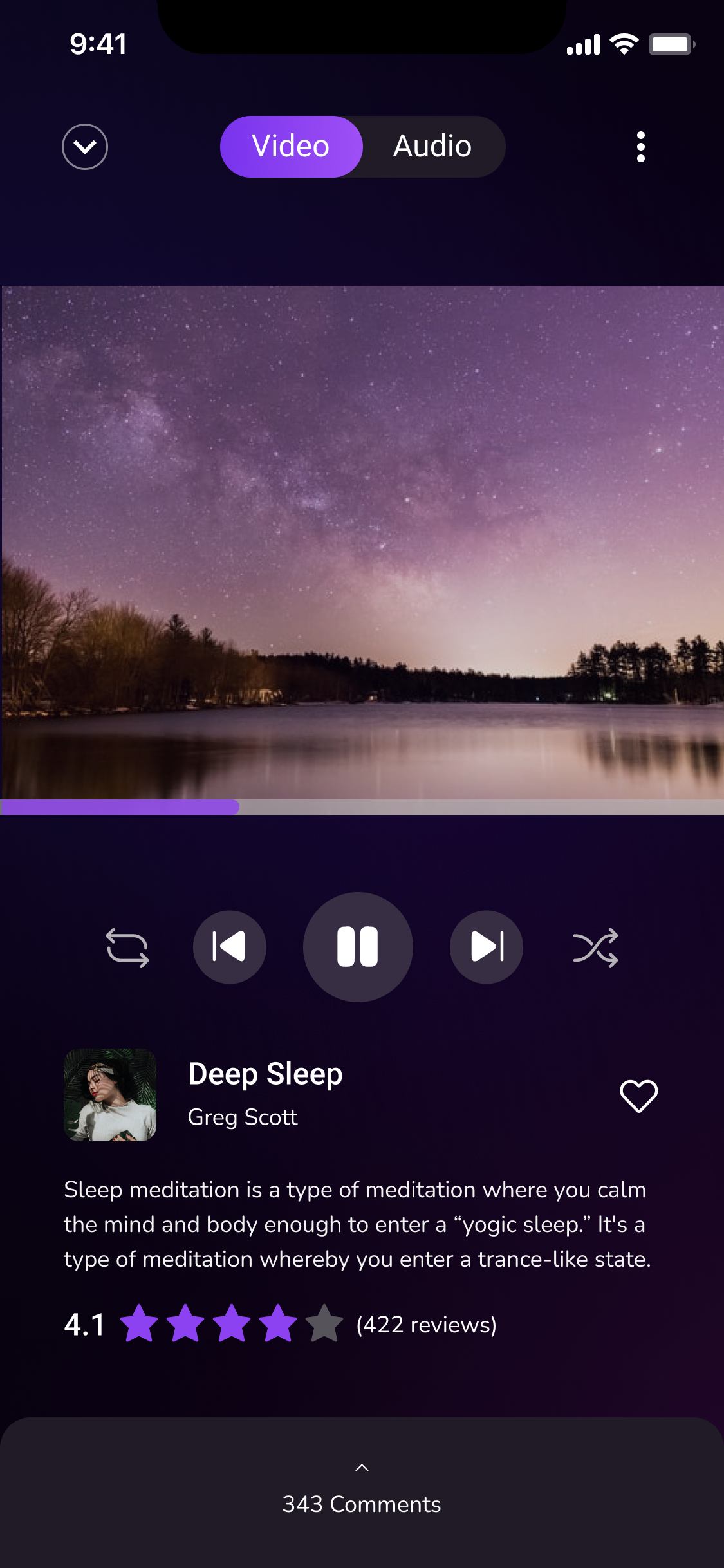
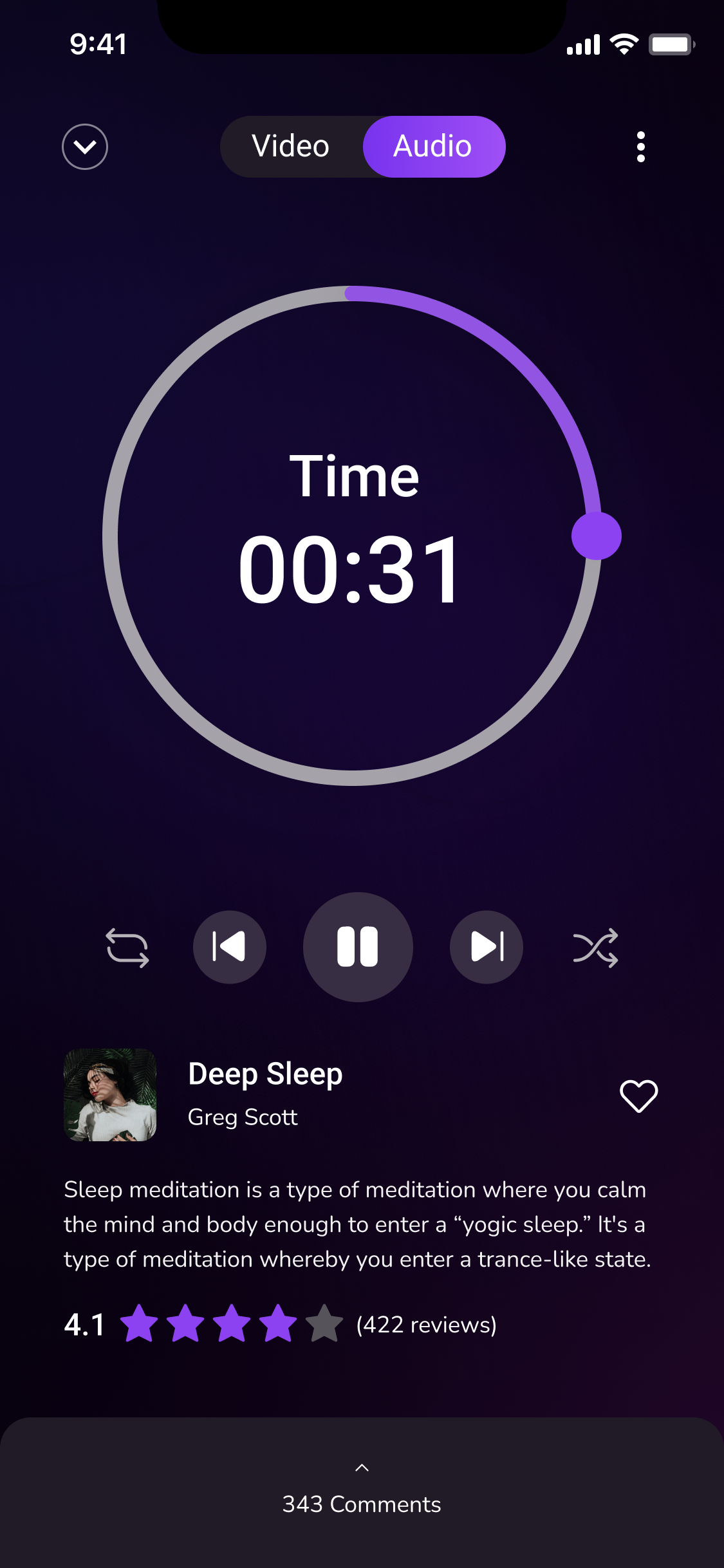
As for the video Audio/Video Screen Components, we wanted to give users the options to watch or simply listen to the meditation, depending on their needs, as well as try to keep the app interactive and dynamic so that they are full engaged.
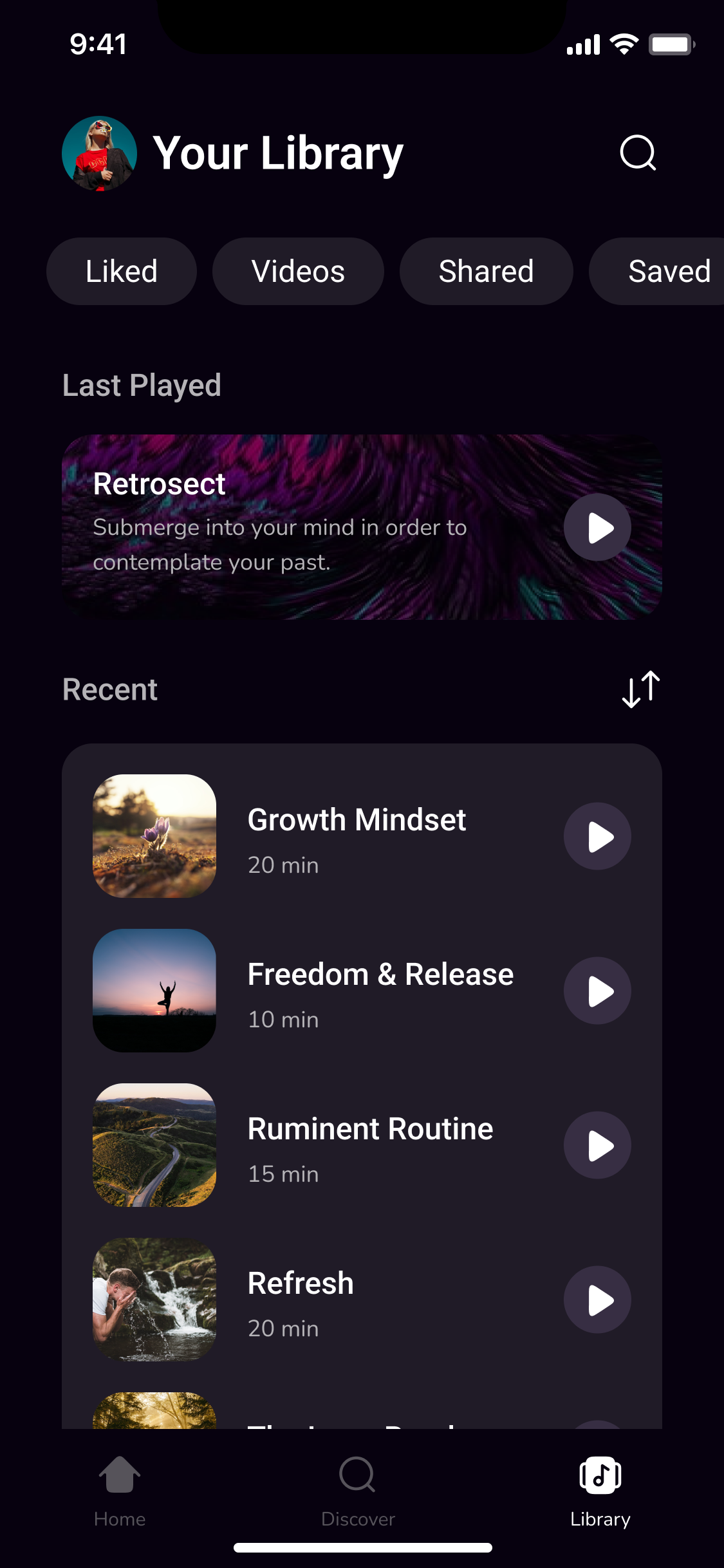
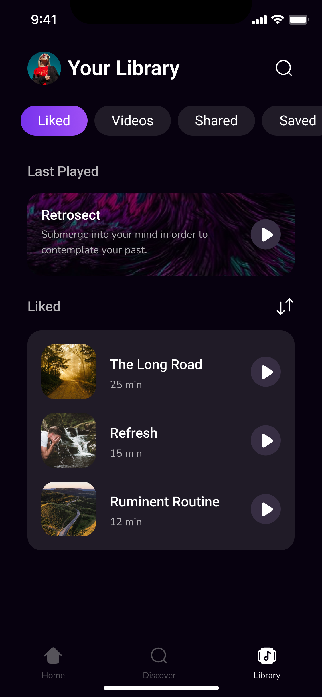
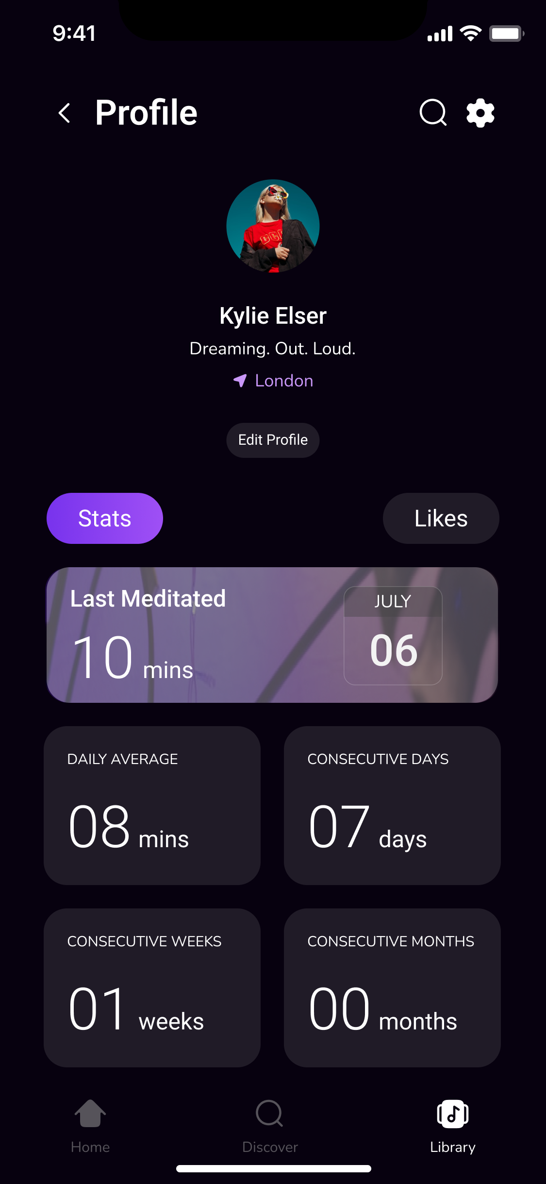
Next, we worked on the Library/Profile Screen Components, this screen allows users to engage with content that they previously accessed and give users the ability to edit their profile. We designed components that can be used across multiple screens.
Hi-fidelity Designs
Having created the components, it was much easier to put the final design together. However, the process was not smooth sailing. We had to redesign the components multiple times before we were satisfied that we had met our objectives.
We took a lot of inspiration from music apps such as Spotify, YouTube Music, and Tidal. We wanted Unplug to become the industry standard for meditation apps. Our goal was for users to be able to find meditations for all their needs.

Prototype
